This is the webdev presentation from 26th June 2019.
Tag Archives: web
Search On Jekyll Blogs
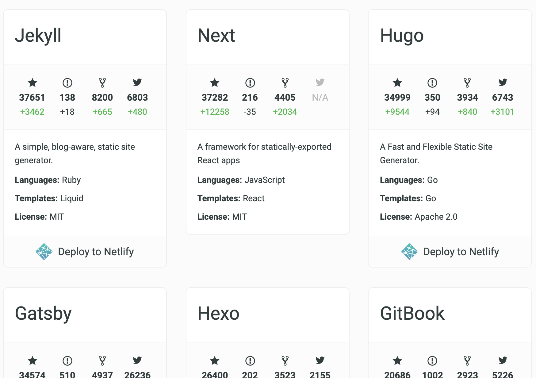
Static site generators are great. No fuss, pure purpose. I use Jekyll because that’s what Github supports the best. But these days, with services like Netlify, you have many options. This site aggregates the top ones, so give it a look if you’re planning on setting up one for yourself.

One thing that’s tricky with static site generators is search functionality. Since there’s no backend, whatever you plan on searching has to be generated the same way other content is. Often, that means iterating over all posts and creating a json file which you can fetch in the frontend and do offline search.
While that works, it doesn’t give you full content search (if you include content in that json blob, it will grow in size and get slower with each new post). But full content search is exactly what you need at times. I needed content search, and I spent sometime researching the options that exist. Below, I’ll list a couple of them, not necessarily only the ones that offer full content search but each suited to some specific use case.
Netlify Functions
Netlify has managed cloud functions thingy (serverless) and it works on top of AWS Lambda. It is very simple to write a function with netlify, and when you push your code, the functions are deployed as well. It comes with a free tier which runs on a 128mb instance. Pretty low, and would time out in 10 seconds if you give it a lot of work.
Netlify picks functions from a directory and pushes them to aws internally. Now, we need our json file to be present in Netlify lambdas directory before the push happens. We can make use of a simple node module Front Matter that would take our _posts directory and return a nice json with frontmatter and body parsed. Then we take this json and write it to a file which we can then import from our lambda function.
Now, for the search function, we can use something like FlexSearch that does offline searching. Just that we’ll use it in the lambda.
And you should update your build command in netlify’s netlify.toml file (or web interface) to run the node script before the jekyll build step.
$ npm run create-json && jekyll build
Keep in mind that the free tier is very low-duty. Try to strip down content by filtering stopwords and doing other optimizations.
On the frontend, you make a GET request with query parameter q to this endpoint like you would with a regular backend search.
Algolia (or any search as a service)
I’d start with stating why Algolia didn’t fit very well for my use case. Their record (think each individual post text plus metadata) size limit is 10kb, so if your content is frequently more than that, and you want it to be searchable, Algolia might not be the best for you. But if you don’t need full content search, or if you write little posts that are usually less than 10kb, it might be a good option to look into.
Essentially, you create a searchable index on Algolia (simply upload a json file or use their jekyll-algolia gem), and use their client side libraries to query this index. They have a nice and simple web interface to do it manually or just use a script to automate it via their APIs.
Like mentioned before, you can implement a two step deploy process to Algolia that removes stopwords and duplicate words from the text before pushing the index. That way you can still fit the record in 10kb.
AWS Lambda
Netlify search uses AWS Lambda internally, but netlify only offers a couple of tiers ($0, $25 and a custom plan for $500 paying customers). On the other hand, AWS has a wide variety of lambda instance sizes and charge per usage which makes it super cheap.
What you lose in this case (compared to Netlify functions) is that you have to set up the CI pipeline yourself from scratch. So no automated pushing of the functions along with your static site. If you have a lot of searches, or heavy search queries, AWS Lambda is the way to go. For very simple and light weight use cases, Netlify isn’t a bad choice. Note that Netlify also deploys to AWS, so your function will work on either service with little to no modifications.
ElasticSearch
This is a complex solution when compared to the others on this list. Essentially you create a simple app on, say Heroku with a simple GET and POST interface. You can pair this app with a free Bonsai ElasticSearch instance. The POST will push data to this instance and GET will fetch search results.
The middleware Heroku app is to simple prevent our Bonsai credentials from getting into the wild. I didn’t think this was a good solution for simple use cases because of the maintenance factor. The reason we use Jekyll (or any static site generator) is to keep things simple, and this search solution is hard to sell to people like us.
In closing
As I found out, there are many ways of implementing a good search feature on a Jekyll (or any statically generated site). I’ve left out details of the implementation as I couldn’t find time to do so but what I learned was that just knowing that these options exist helps a lot. So the next time I’m thinking, “hmm, I’d like to have a search here, but not sure how to handle the logistics that come with it”, I’d already have a few options!
Thank you for reading.

Doing More With Jekyll – CloudCannon And Netlify
I’ve been using Jekyll for the past couple of years now. I started this blog on Ghost, but soon moved it to Blogger. Later, I discovered that I could simply use Github Pages for hosting my static site. For someone coming from shared PHP based hostings like 000webhost and what not, this was unreal. I moved to Github Pages and have been using Jekyll since then.
I always liked Jekyll for the simplicity, no-nonsense setup and complete control over what gets served to the visitors. Plus given the nice Github integration, no sysadmin and total control over the content, it is just perfect for personal blogging and simple static sites.
But what I recently learned was that the land of static sites isn’t all dry. There are some nice tools that one can use to enhance their experience with Jekyll. In this article, I’ll be talking about two such tools that I discovered recently and found interesting: CloudCannon CMS and Netlify’s Split Testing
CloudCannon
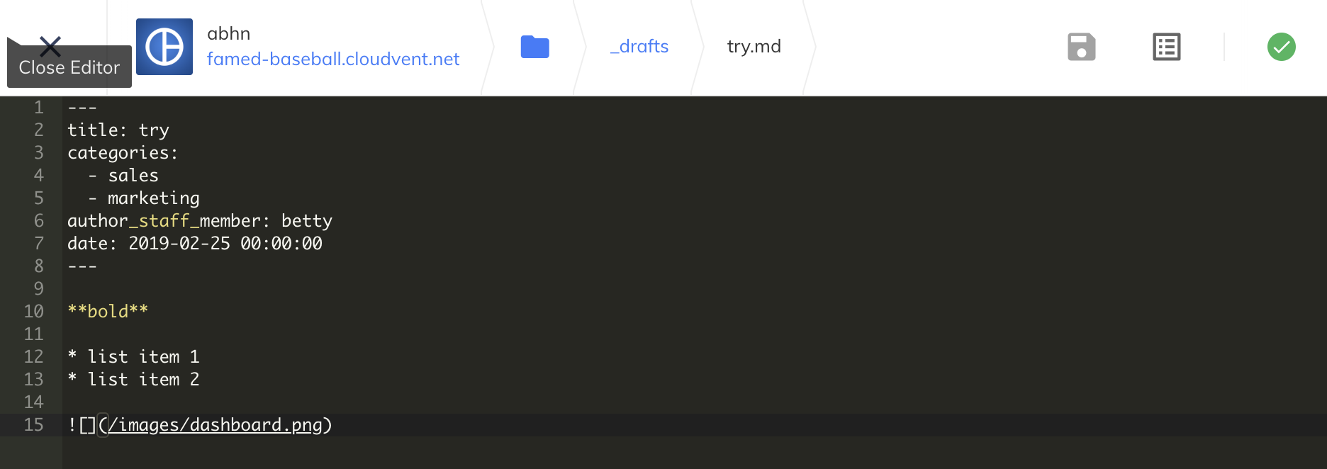
CloudCannon is an online CMS for Jekyll sites. If you have ever used a CMS like WordPress or Joomla, CloudCannon would feel right home. If not, think of it like having a Google Docs-like interface for editing your site (as opposed to writing HTML or Markdown). It is more limited than your traditional CMSs in the sense that you cannot install plugins or change the appearance of your site from the panel (you can, but then you’ll have to code that logic yourself into the app and use flags in the frontmatter to selectively display component). But again, since you’re using a static site generator, you probably don’t plan on having a lot of plugins anyway.
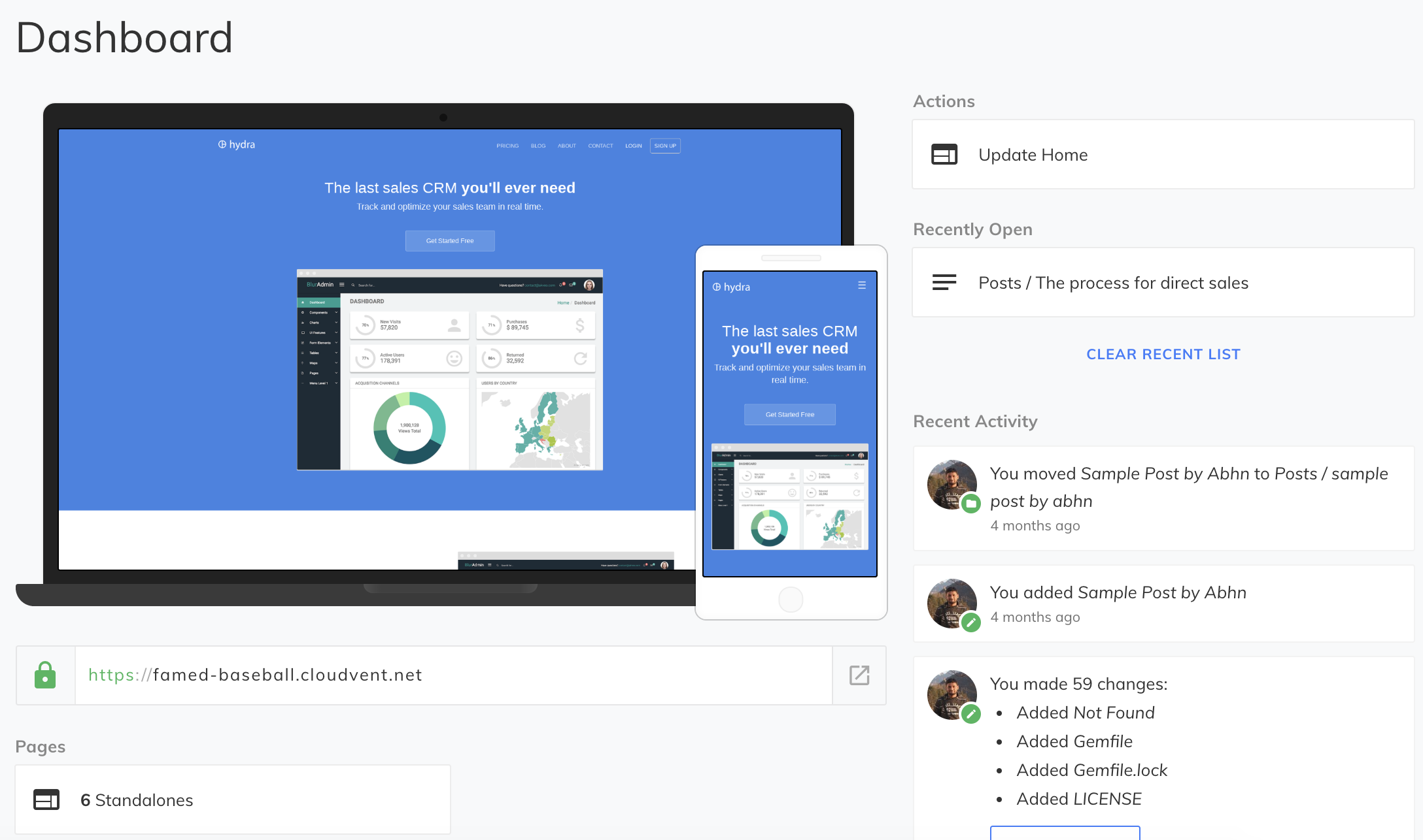
The interface is simple. You get a WYSIWYG editor, and a sidebar with all the frontmatter fields. Interestingly, you can name the frontmatter fields in a way that CloudCannon recognizes to get more from the CMS. For example, if your field name ends in _html, CloudCannon will make it a WYSIWYG field. Same goes for _time, _image and many others (find them in the docs).

The advanced configuration options includes free SSL, CDN, hosting, backups and authentication. You might not need it (I use Cloudflare which gives free SSL and CDN, and Github for hosting and backups), but good to have. One complaint I had with CloudCannon was that if a site build failed, CloudCannon wouldn’t abort the deploy. It will deploy the failed build and your site would go offline until you revert. I just hope there’s a setting for that somewhere, but that it isn’t turned on by default is worrying enough. So for now, I’d rather just use CloudCannon for CMS and host my site someplace else.
CloudCannon is free for single user sites and syncs well with Github. It sits in a sweet spot between a bloated CMS and simplistic static site generator, and enhances your productivity as a content creator while letting you keep all the control over what gets served to your readers.
Netlify – Split Testing
Netlify is a static site hosting service. I like it because of the few but very useful tools they provide. You can host your Jekyll site on Netlify, and it supports Node and Ruby-based build tools (so you can use grunt/webpack for your SPA apps). For quickly hosting a nice website with some frontend framework (say a ReactJS app), Netlify is great (although I’ve seen it used in production as well).
Netlify provides a rich set of configuration options, including functions, forms and authentication mechanisms. What I really found interesting was their split-testing beta feature. So what is split or A/B testing, you might ask?
If you want to test two versions of your website and see which one do your users prefer (in terms of a goal that can be anything like time spent on your website or product sales), A/B testing can be a good way to do it statistically.
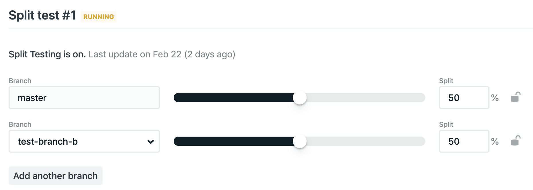
In a nutshell, you create different branches with different code and then use a nice slider to adjust the percentage of traffic that would go to each branch. This feature is still in beta, and the split test turns itself off whenever any branch is pushed (which, I was told, is a known bug). A cookie gets set on the client side which can tell you what variant it is, so you can bake some logic around that to get stats and such.
In closing
I was pretty excited to find these interesting tools built around our humble Jekyll. If you are a Jekyll user, I’d love to hear about your workflows. I’m planning to bake a little asset pipeline on my blog soon, so any tips for that are welcome!
Thank you for reading.
Let’s Talk About CSS
CSS can be deceptively complex. And to most programmers, rightly so. We programmers tend to find patterns that help us relate the new information to what already exists within us, draw parallels and think of real world analogies. That is one reason learning your second or third programming language is much faster than learning the first if they share some paradigms. But with CSS, many of us have a memorize-first approach. While it works, it is more fun (and easier to debug) if we understands a little bit of the under-the-hood stuff.
In this post, let’s try to demystify some of the aspects of CSS that we as engineers should’ve asked when we got started with CSS. Better late than never, right?
Understanding The Browser
Starting with something basic: When you request a webpage, and it is downloaded to your system (computer, mobile phone etc), it is in the form of HTML code (at the application layer, that is). The browser then parses the html, line by line, downloading any external resources that it finds with separate HTTP requests. The HTML that is parsed is structured as a DOM tree, which can be thought of like a family tree, but with HTML elements. DOM defines the structure of the page; what goes where and what information does each node have.
On the side, the browser (in that, the rendering engine) is also processing the CSS files. CSS files are processed, and then styles for each node (HTML element, that is) is calculated, and applied to that node. The end result is ‘painted’ and rendered to the client’s screen.
So as you can tell, it is pretty straightforward. What’s interesting is the process of calculating the styles to be applied to each node, and that’s what we’ll be talking about for the rest of this article.
CSS Parsing
There are a couple of challenges when deciding what style applies to a particular element.
- The engine has to first parse the CSS and get all the values for each property.
- Then the engine has to decide what set of properties get applied to each element depending upon the specificity of the selectors, inherited and default values (since each element may have multiple rules that seem to style it).
- Then the selected styles are converted into pixel values (we may have used rems, ems, percentages or vh/vw in our CSS code) as that’s what browsers understand.
In particular, the CSS engine looks for the following when dealing with a style and deciding if it really applies to a given node.
!important
If a property has !important in the value, it is immediately selected for the final processing irrespective of the specificity and code order.
Specificity
To put it simply, specificity deals with how ‘specific’ is the selector (based on concrete rules). For example, if you have some list-items, each with a class selector and CSS background-color: red; and one of them also has an ID selector with the CSS background-color: green;, then which background-color do you think gets applied to that particular list-item? It is the style in the ID selector.
Similarly, if the ID selected list-item had an inline style, the inline style would take precedence. Formally the hierarchy is
Inline style > ID selector > Class selector > Element selector
Browsers maintain an internal tuple of the form (0,0,0,0) representing the counts of each selector hierarchy viz. (inline-style, ID, class, element). For the selector h1.heading#top-heading, the tuple will look like (0,1,1,1), that is, one for ID, one for class and the last for element selector.
Suppose you had another selector h1.heading#top-heading#blue-color. Now the tuple for this would look like (0,2,1,1) as there are two ID selectors. If the browser had to choose between the former and this, it would choose this one as it has a higher specificity.
Source Order
Now what happens if specificity of two selectors match? Simple, the last selector in the source code (even in case of multiple files) gets selected for application.
Cascade
Cascade (n): A process whereby something, typically information or knowledge, is successively passed on.
The term Cascading in Cascading Style Sheets says something about the priority scheme that’s used to determine what style gets applied to an element when multiple rules match. In simpler words, if body has font-family: Arial; specified and the h1 has font-family: Helvetica;, Helvetica gets applied to the h1. However, if font-family on h1 wasn’t explicitly declared, Arial would’ve been selected by inheritance. This is how inheritance works in CSS.
Not every property is inherited. And it doesn’t make a lot of sense to inherit everything either. For example, setting margin: 0 10px; on body doesn’t automatically apply it to every child of body which doesn’t have an explicitly declared margin property. The ones which don’t have an explicitly declared margin get a default margin of 0px. This is how default properties work in CSS.
The obvious followup question is, how to tell if something will be inherited or default value will be selected? Honestly, I’m not sure. I usually just ask myself if it makes sense to have this property inherited or defaulted. More often than not, that’s enough. In case you’d want to explicitly make a property to inherit or default a value, use inherit and initial keyword respectively.
In Closing
That’s it for this little primer. I hope you found it useful. For a nice illustrated guide on this, check out this article on Mozilla. Thank you for reading.
Testing Websites On Kindle Paperwhite
I bought an Amazon Kindle this week, a device for reading books. It does a magnificent job at improving your reading speed, giving meanings and Wikipedia lookups on the spot and in general making reading a much more convenient and peaceful experience (for a non-native reader, at least).
I was pleasantly surprised to find an experimental web browser in it. I wanted to know how experimental it is. This post is going to be about that.
Warning: Multiple images ahead. Might take a few seconds to load. Patience.
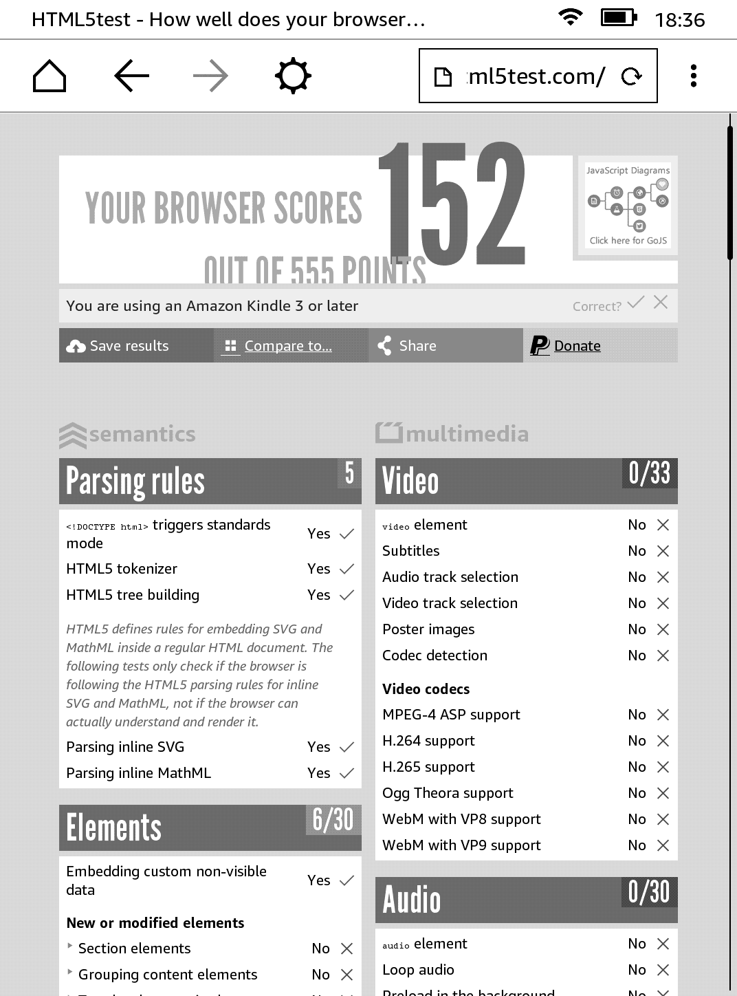
Browser Score
One way to check how good or modern a browser is, is by checking and comparing html5test.com. While not all the features are made equal (some might be more important than others depending on the situation), it definitely gives us a good ballpark figure to compare browsers. For example, Latest Firefox (62.0.3) scores 493 on that test, while lastest Chrome (69) scores 505. Let’s see how our Kindle browser performs in this test!

Hmm. Not bad. And given that it supports Javascript (which was a little surprising to me), I think it works pretty well for its ‘experimental’ tag. Not web 2.0 of course, but decently well.

Testing Websites
Benchmarks and synthetic tests do their job, but nothing beats real-world web browsing, right? I tried to spend some time surfing the web with the Kindle’s browser to see if it would work for casual browsing, or any browsing for that matter. Let’s see how some of the popular websites performed on the browser.

Google was pretty functional, and I didn’t have much trouble searching and navigating through search results. It felt very similar to how surfing on Opera Mini felt (remember that browser?). Usable, I’d say.
Gmail
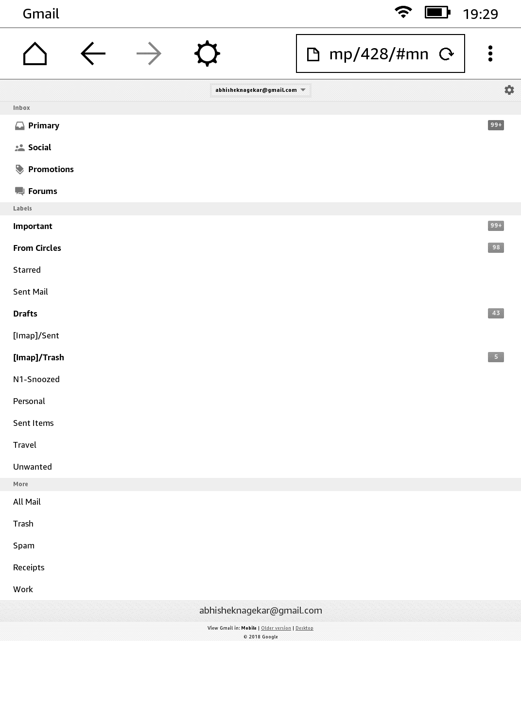
In all seriousness, I didn’t expect Gmail to work. But it does and gives you a nice mobile view where you can read (and even compose) emails. Not the most convenient way of doing it (and using a randomized twenty-six character password didn’t help either), but can be done nevertheless.
Amazon

Amazon.com was kind of disappointing. Given how their shopping site looks even on modern browsers, I had expected it to look more or less the same, but the website essentially disappeared on Kindle.

The item listing page was a little better, although not a lot.
Wikipedia
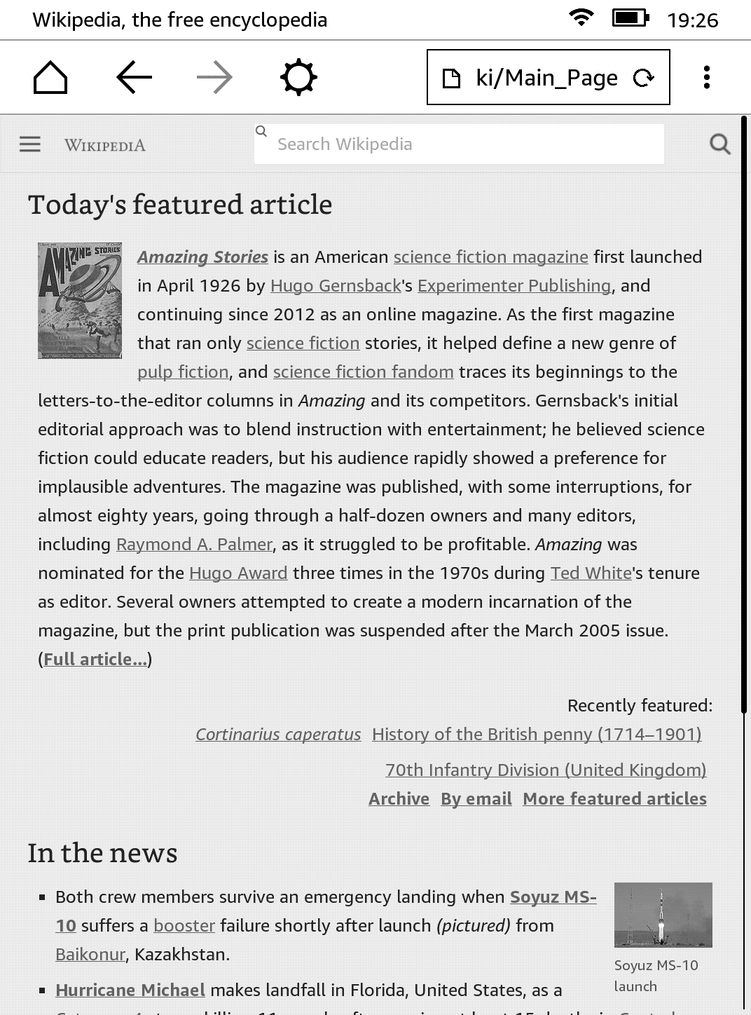
Wikipedia was more or less what you’d see on a full browser, at least for reading existing articles. I didn’t try the contributors section (I’m lazy that way).
Youtube
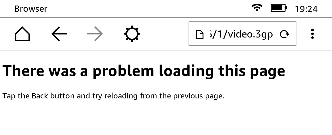
The mobile Youtube site opens up with large thumbnails. On clicking a video, the media file (video.3gp as can be seen in the address bar) opens and as expected, doesn’t play. So Youtube is pretty unusable on Kindle.
xkcd
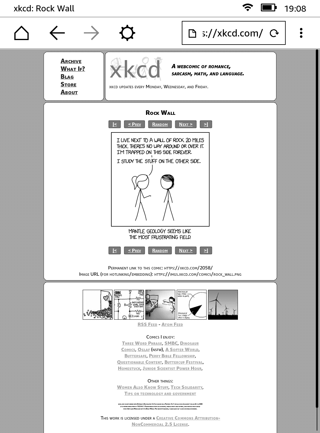
I couldn’t tell a difference between this version and the one I usually open on Chrome or Firefox. Nearly perfect. Nice work, Randall!
This blog!
Okay, I know. Not a popular website. One of the primary design goals while making the template for this blog was accessibility. I was very pleased to see everything in place (except for a few flexbox dependent sections on the homepage which needs a fix). Well done me! (I’ll show myself out)
Conclusion
I think Kindle’s little browser serves its purpose and does it well. Text is sometimes hard to read given the gray and black display. In my opinion, the bigger problem was that of scroll and typing. E-ink displays are very slow at refreshing, which makes scrolling web pages a pain. Then the typing experience is not that great either. I’m not complaining, of course. That would be very stupid. Honestly, I’m quite impressed with this device. It is well built and makes reading very convenient.
I want to think that the browser is so bare because the engineers at Amazon didn’t want us to switch to surfing Youtube or Facebook while reading that book. So in that sense, it isn’t a bug, it is a feature. Anyway, I hope you enjoyed this little article. I had nothing better to do on a Saturday evening, so this was it. Thank you for reading.

Accessibility-First Web Development
When you zoom out a bit and think fundamentally, the web is just an input/output device for the end user. One can send and receive data and…umm? and that’s basically all you can do over the internet. When you think about it this way, the web seems like a lab experiment that got out of hand.
Now when I, as a web engineer, think of what the web is, I find myself in midst of complex jargon, standards, protocols, incompatibility and all the bloat surrounding web development these days. But for the end user, it is simply an IO device and that is something we mustn’t forget.

So if the web is fundamentally an IO device, shouldn’t we spend some time figuring out how to engineer things on top of it such that they are accessible to as many people as possible. I think so, and that is what I’ve been learning about these days. Without a doubt, the entire software ecosystem is getting more and more complex by the second, the merits and demerits of which are arguable. It gives me immense joy to work on SPAs and PWAs as an engineer. But not every website has to be an SPA. Heck, not every website has to have AJAX or even jQuery. Using plain old <form action=""> does not make you ancient. It makes you more accessible to people who have Javascript disabled.
But don’t stop there. Implement AJAX. Think about your use case and if it makes your or your visitors’ life easy, go ahead and drop React or any other modern web framework. But do so progressively, making sure your webapp is ‘functional’ for someone on a 320px wide browser on a slow internet connection as well as for any visitor on the latest iPad and 4G.
Let’s try to list down some tools and tricks we can keep in mind while developing our next web application to ensure that our web stays the medium it was meant to be; a library open to all, and not a shopping mall for the rich.
Progressive Enhancement
Progressive Enhancement is when you start developing a website with focus on core functionality and content accessible to as many users as possible, and then progressively keep on adding features for the modern browsers. That way, you satisfy the requirements and keep your site accessible. I suppose the only downside to this is that it will take more time to develop and build a web app this way, and I agree that time is usually the only commodity that startups and mid-sized companies don’t have these days. But most websites are not startup products, they’re information portals, personal blogs and wikis. No, I’m not discouraging startups from attempting progressive enhancement, but having worked at a lean-ish startup, I understand that this approach is not for everyone.
Speed

Your website has to be fast. It has been repeated by many industry veterans so you don’t have to believe me. We need to take pride not just in the way our websites look, but how quickly it loads. After all, we’re engineers.
One approach to this is to understand exactly what is being made. A personal blog does not need analytics code. Static social buttons with hardcoded links are much faster (and better from your user’s privacy perspective) than those dynamic ones. Use a CDN and HTTPS certificate, both of which are free.
Mobile Responsiveness
It really does not take much effort to make a website mobile responsive these days. Native CSS gives you enough tools to create nice grid layouts which respond to the different browser widths. I like to test my websites to a minimum of 320px, and have fixed max-width viewport (purely personal preference). Given the vastness of screen sizes these days, it helps me have a reasonable window for deciding how to collapse sections based on different widths. Responsive web design isn’t easy, but not very difficult either. Recommended reading: Responsive Web Design – Ethan Marcotte
Content

The content is the heart of your website, and it needs to be treated as such. Check out any popular Indian news website for guidelines on how not to place ads and prioritize content. If your website doesn’t resemble that level of junk overload for the user, you’re doing better than most.
Text & Colors
Text in lighter shades of gray on even lighter gray background look softer to eyes, but care must be taken not to overdo it. Remember that not everyone has a Retina or IPS display that you’re using to develop your beautiful webapp. It happened with my in LaughGuru. At some places, the text on the design mockups was so contrast-less, I had to change the angle of my monitor just to be able to read it (I had an old 1024×1280 square TFT LCD display on my desk).
In Closing
It is always nice to learn something new. I hope this learning continues, and I also hope you found some value in this article. Thank you for reading.