I bought an Amazon Kindle this week, a device for reading books. It does a magnificent job at improving your reading speed, giving meanings and Wikipedia lookups on the spot and in general making reading a much more convenient and peaceful experience (for a non-native reader, at least).
I was pleasantly surprised to find an experimental web browser in it. I wanted to know how experimental it is. This post is going to be about that.
Warning: Multiple images ahead. Might take a few seconds to load. Patience.
Browser Score
One way to check how good or modern a browser is, is by checking and comparing html5test.com. While not all the features are made equal (some might be more important than others depending on the situation), it definitely gives us a good ballpark figure to compare browsers. For example, Latest Firefox (62.0.3) scores 493 on that test, while lastest Chrome (69) scores 505. Let’s see how our Kindle browser performs in this test!
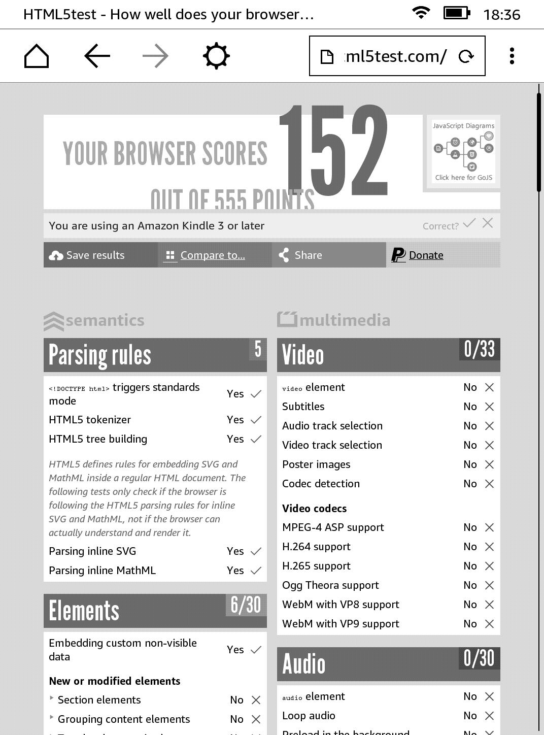
Hmm. Not bad. And given that it supports Javascript (which was a little surprising to me), I think it works pretty well for its ‘experimental’ tag. Not web 2.0 of course, but decently well.

Testing Websites
Benchmarks and synthetic tests do their job, but nothing beats real-world web browsing, right? I tried to spend some time surfing the web with the Kindle’s browser to see if it would work for casual browsing, or any browsing for that matter. Let’s see how some of the popular websites performed on the browser.
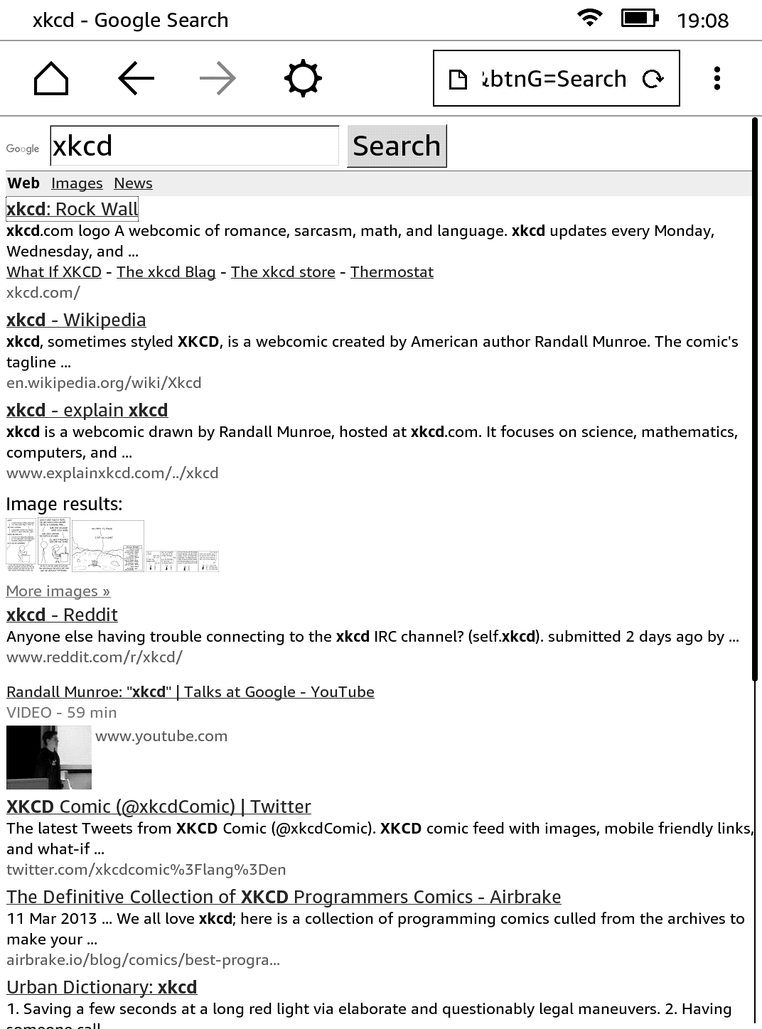
Google was pretty functional, and I didn’t have much trouble searching and navigating through search results. It felt very similar to how surfing on Opera Mini felt (remember that browser?). Usable, I’d say.
Gmail
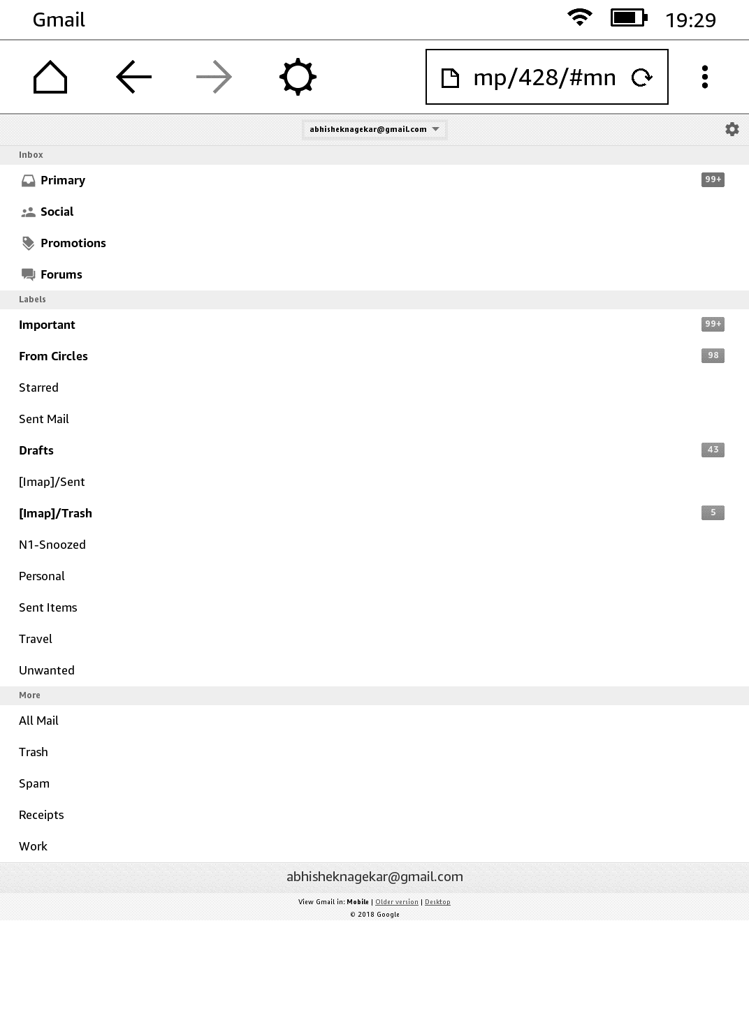
In all seriousness, I didn’t expect Gmail to work. But it does and gives you a nice mobile view where you can read (and even compose) emails. Not the most convenient way of doing it (and using a randomized twenty-six character password didn’t help either), but can be done nevertheless.
Amazon
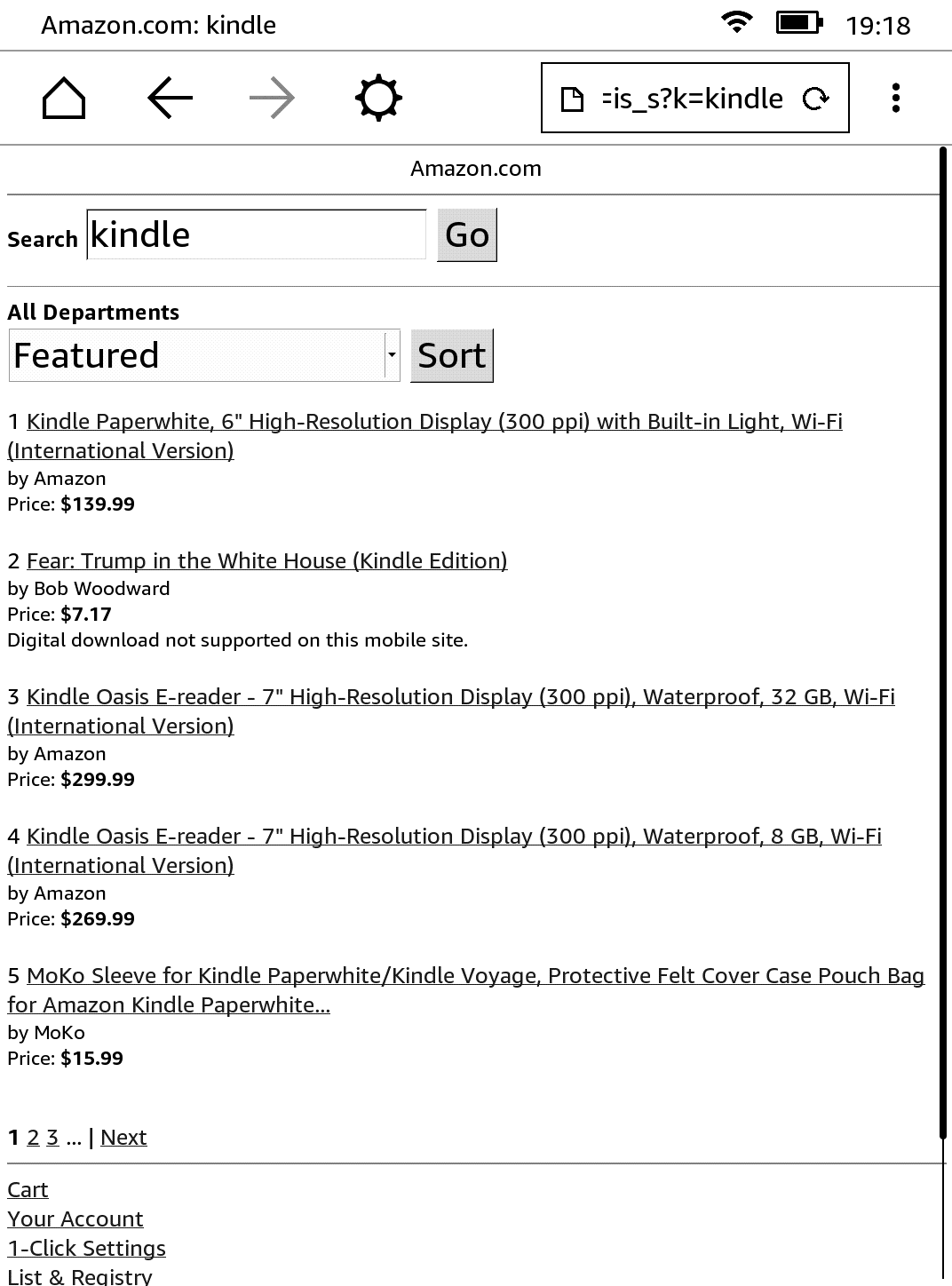
Amazon.com was kind of disappointing. Given how their shopping site looks even on modern browsers, I had expected it to look more or less the same, but the website essentially disappeared on Kindle.
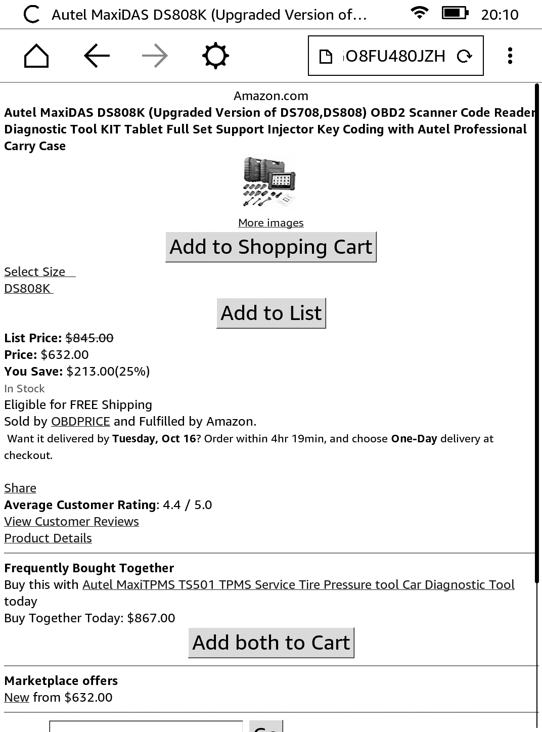
The item listing page was a little better, although not a lot.
Wikipedia
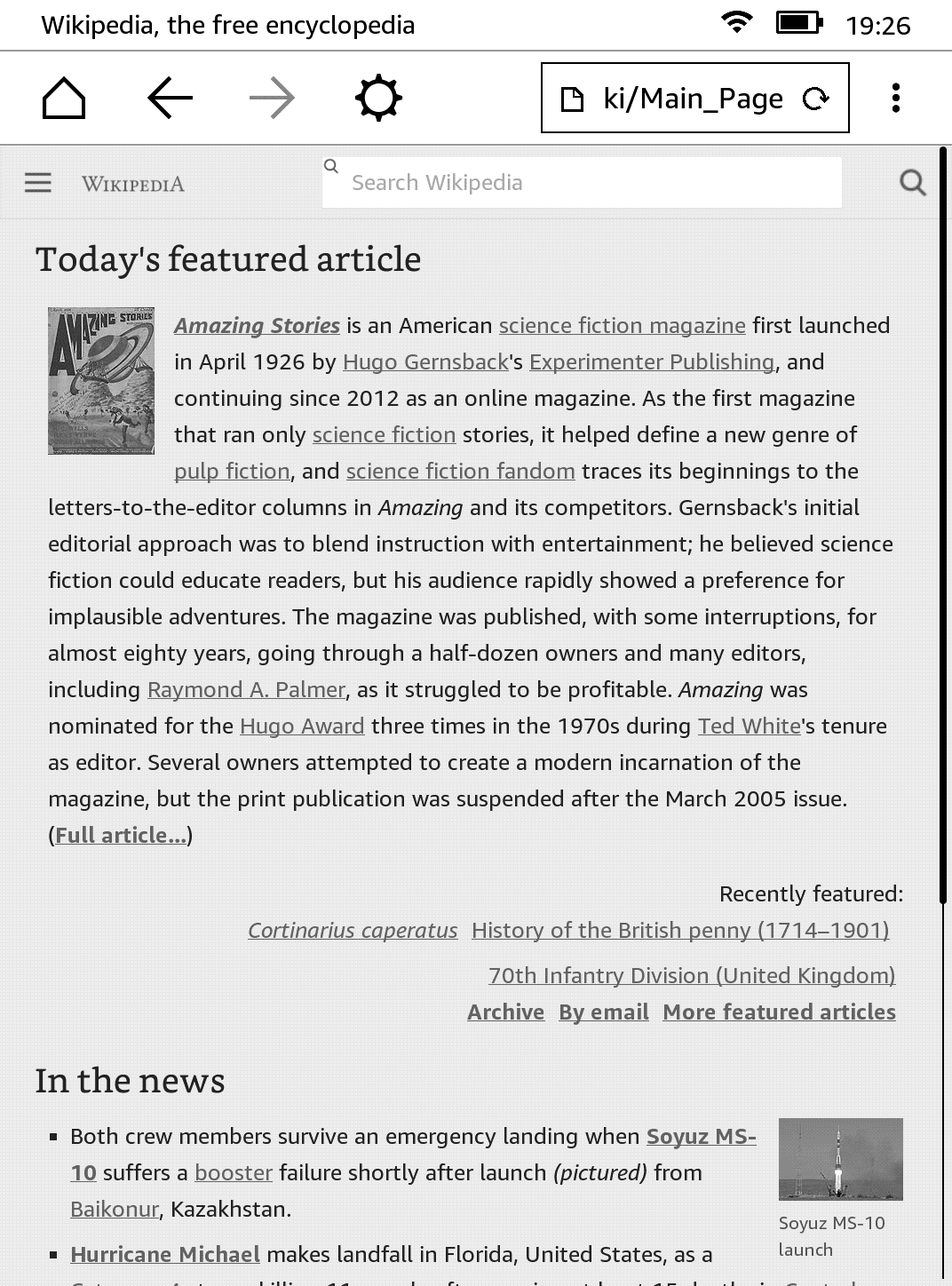
Wikipedia was more or less what you’d see on a full browser, at least for reading existing articles. I didn’t try the contributors section (I’m lazy that way).
Youtube
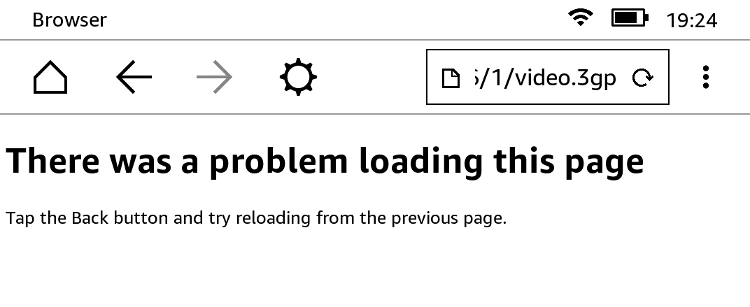
The mobile Youtube site opens up with large thumbnails. On clicking a video, the media file (video.3gp as can be seen in the address bar) opens and as expected, doesn’t play. So Youtube is pretty unusable on Kindle.
xkcd
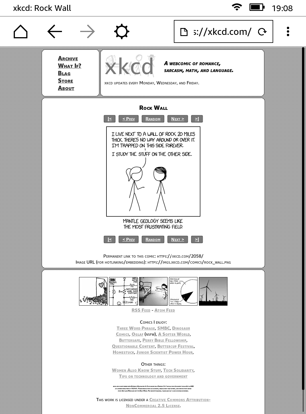
I couldn’t tell a difference between this version and the one I usually open on Chrome or Firefox. Nearly perfect. Nice work, Randall!
This blog!
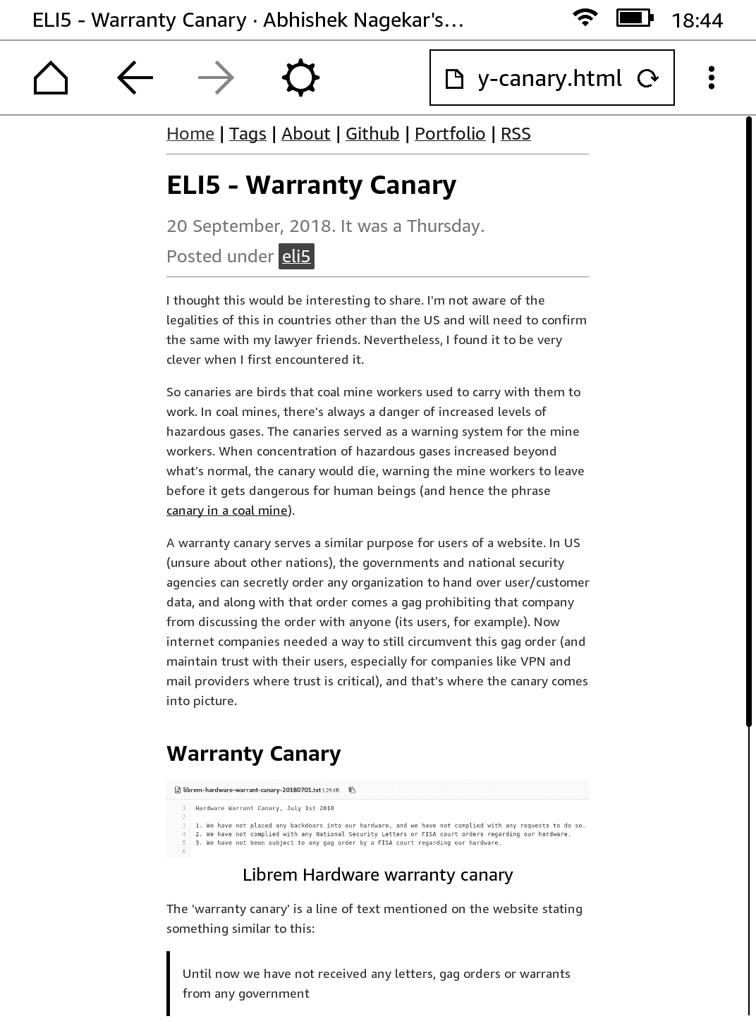
Okay, I know. Not a popular website. One of the primary design goals while making the template for this blog was accessibility. I was very pleased to see everything in place (except for a few flexbox dependent sections on the homepage which needs a fix). Well done me! (I’ll show myself out)
Conclusion
I think Kindle’s little browser serves its purpose and does it well. Text is sometimes hard to read given the gray and black display. In my opinion, the bigger problem was that of scroll and typing. E-ink displays are very slow at refreshing, which makes scrolling web pages a pain. Then the typing experience is not that great either. I’m not complaining, of course. That would be very stupid. Honestly, I’m quite impressed with this device. It is well built and makes reading very convenient.
I want to think that the browser is so bare because the engineers at Amazon didn’t want us to switch to surfing Youtube or Facebook while reading that book. So in that sense, it isn’t a bug, it is a feature. Anyway, I hope you enjoyed this little article. I had nothing better to do on a Saturday evening, so this was it. Thank you for reading.